Reports
Overview
All 30+ reports (green sheets) will update automatically based on data entered in other sheets.

If something is wrong in a report, you'll go to another sheet to fix (usually your Journal).
Report Headings
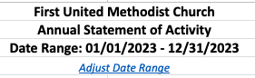
The following are typically listed in the header of each report:
- Your organization's name (from your Settings sheet).
- The report name (safe to override if desired).
- A date range populated via a formula.
- The date range can be modified via the Date Controls sheet for standard reports, or the report's period filter in cell A1 for period reports.
Annual, Monthly, Quarterly Reports
Many reports will contain an A, M or Q in their worksheet name:
- A = annual
- M = monthly
- Q = quarterly
Standard Reports
These will display all journal data through the date chosen in the Date Controls sheet.
Date Controls
This sheet lets you control when transactions appear in standard reports. You can wait to “publish” a month until after you’ve entered all transactions and reconciled.
By default, the setting is Current Date, which means all transactions up through today show in standard reports. If you’d rather see only finalized months, use the dropdown to select the last day of any completed month. Standard reports will then include transactions only through that chosen date.
Period Reports
These reports have their own period filters (Month, Quarter) in cell A1 and are not affected by the date controls setting. These reports are marked with (P) in their tab names. These allow you to look at a smaller "snapshot" of time, such as a specific month or quarter.
Summary Reports
About half the reports are labeled as "summary" reports. These reports "roll up" activity in your accounts to their related account groups. Look at these reports when less detail is desired.
Cash Flow Reports
The Cash Flow Overview report shows your starting journal balance for the year, adds total revenues, and subtracts total expenses - giving you your current journal balance.

It also provides a graph showing total monthly expenses, revenues, and how those have affected the journal balance over the year.
The Monthly Cash Flow report shows the beginning and ending journal balance each month, along with the total revenues, expenses, and net change for the month.
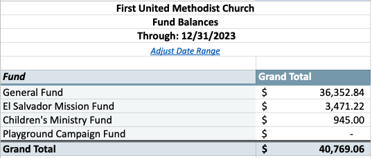
Fund Reports
To see fund balances and how revenues and expenses have affected fund balances, see the twelve fund reports.
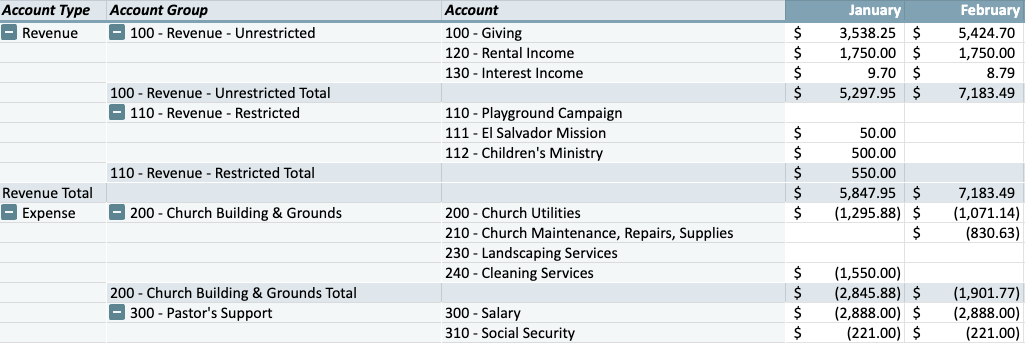
Activity Reports
To see revenue and expense activity summarized for the organization (across all funds), see the six activity reports.
Budget Reports
To see how revenues and expenses are tracking to your budget, see the eight budget reports.
Positive differences will be shown in green, negatives in red. A red difference for a revenue account means you're behind budget by the amount shown. A red difference for an expense account means you have overspent that budget item by the amount shown.

Year-to-Date Budget Reports
The YTD (year-to-date) budget reports help you see how you are tracking versus where you would expect to be at this point in the year (compared to a percentage of your annual budget).
You have three options (controlled on the Settings sheet) for how and when your YTD budget will increase (this setting is effectively irrelevant if you utilize Date Controls). The percentage of the annual budget included in the report is shown in the report header.
Creating Custom Reports
All but the Cash Summary report are built using Pivot Tables.
Users who know how to use Pivot Tables can modify the reports as they wish, but it is recommended that you copy an existing report worksheet and make edits to your copied version, preserving the original report as a backup.